Karen Schiff at BravinLee Programs

At their Chelsea gallery, BravinLee has a vitrine dedicated to the display of Book Arts. Works that address the topics of typography and linguistics are considered part of the Book Arts genre. Currently on display are recent prints by Karen Schiff. These works are created using alphabetic and numeric rubber stamps. The artist prints on various types of commercial stamp album graph paper in a very small scale grid.

15-13-1

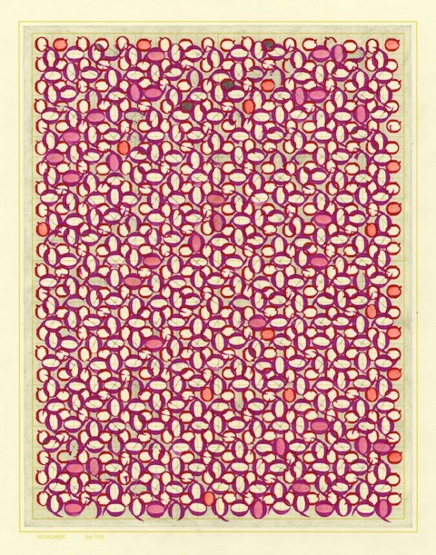
Karen Schiff – “oOo” 2015 Ink graphite, and watercolor on stamp album paper
Picture courtesy of the artist and the gallery

“oOo” from 2015 is a type of tiling constructed out of zeros and capital letter O’s. The artist takes advantage of the two-fold rotational symmetry of these forms. By rotating the figures 90 degrees and overlapping the edges, Schiff has filled the rectangular plane with ellipses. This print is an exploration of the geometry of these two typographic elements.

15-13-2

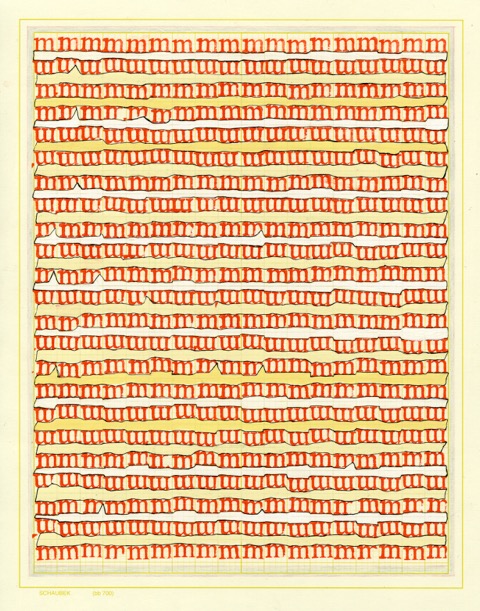
Karen Schiff – “mmm…” 2014 Ink, graphite, and gouache on stamp album paper
Picture courtesy of the artist and the gallery

“mmm…” made in 2014 is composed using only one type of rummer stamp, the lower case “m”. At first glance, the image appears to be a horizontal rows of vertical marks, but upon closer inspection you see the top curves of the m’s. What makes these rows of m’s interesting is the fact that the letters have no symmetry, but lined up appear to create a consistent pattern.

Schiff hand stamps each of these letters individually to form detailed images. The imperfections of the printing process create slight discrepancies in the patterns. This is an important part of Schiffs artistic process. By removing the letters and numbers from a traditional text format of works or calculations they lose their direct linguistic and numeric connotations, becoming abstract forms. This allows the viewer to explore the abstract shapes geometrically. We look at numbers and letters all day with out thinking mathematically about their shapes. In this his new series of prints Schiff has invited us to look at numbers and letters in a different way.

Susan Happersett

Geometry at the Armory Show

For one week each March New York City becomes the epicenter of the contemporary international art world. There are at least 6 art fairs all running pretty much simultaneously. The largest is the Armory Show. It is too huge to fit in the Armory so it takes place on two huge piers on the Hudson river. Over one hundred gallerists form all over  the planet set up exhibitions rooms to showcase the their inventory. The opening night is a very noisy, crowded and rather intimidating event. I saw quite a bit of art with Mathematical subject matter. For this blog entry I have decided to focus on three works that are about Geometry.

15-12-1

Gabriel de la Mora at Sicardi Gallery

Sicardi Gallery from Houston Texas featured this amazing construction by Gabriel de la Mora at the entrance to their booth. This work is a nod to minimalist paintings from the 1960’s and 70’s but with a twist. It is composed of match boxes.The red brick shaped rectangles that make up this work are actually the red phosphorous paper you find on the striker of a match box. This unexpected choice of material makes us look at the repetitive nature of the geometry with a more emotionally charged reference point. Adding the element of fire changes the theme of the work, but the geometry stays true to the Minimalist roots.  La Mora’s background as an architect is apparent in the precision involved in the creating the parallel lines to form the concentric rectangles. This work also has both a horizontal as well as a vertical line of symmetry.

15-12-2

Julio Le Parc Galeria Nara Roesler

The large mobile installation by the famous Argentinian artist Julio Le Parc at the Galeria Nara Roesler (Sao Paulo) is a sphere composed of small flat rectangular acrylic shapes. There is a great sense of movement in this sculpture, and the semi-transparent yellow pieces of acrylic play with the light. It almost seems like magic that a grid of rectangles can render such a lively sphere.

15-12-3

Claudia Wieser at Sies+Hoke Galerie

Claudia Wieser’s ceramic wall installation takes center stage at Sies +Hoke Galerie from Düsseldorf, Germany. The images of this work feature a right triangle, an isosceles triangle, as well as two circles. It seems to pay homage to a geometry text book. What I find visually interesting in this piece is the use of tiles, which creates a secondary underlying square grid. This grid is instrumental in the coloring of the large circle.

I have been attending the Armory Show for years. In past shows there were times when there was very little presence of Mathematics in the art work presented, but this year I was quite pleased to find  a number of interesting examples.

Susan

Sarah Stengle – Inspirational Conics

I look at a lot of art and I find quite a bit of work with Mathematical elements, but when I find new art inspired by a book of Mathematical proofs and figures I get really excited. Stengle’s new and ongoing series of drawings is based on Apollonius of Perga’s book “Conic Books I-IV”.  Apolonius of Perga (262BC-109BC) was an ancient Greek geometrist who is famous for his innovated work in the mathematical field of conics. He explored the properties of conic sections and furthered our understanding of ellipses, parabolas, and hyperbolas.

Stengle has been collecting vintage postcards for a year. These postcards serve as the background image for her drawings. The choice of postcards is very important, as the artist looks for older non-glossy cards that can be drawn on. The subject matter on the card must also be fairly uninteresting visually so they can support but not over power Stengle’s mathematical imagery.

Each drawing is based on a proposition from “Conics Books I-IV”. There are three types of cards in this series. Some of the cards feature an accurate figure from a proposition in the book. In this case the book and proposition are written on the back of the card. Some of the other drawings have deviations from the figures in the book, but the aesthetics are interesting. Here the artist uses the work, and states the proposition and the fact there is a error on the back of the card. Finally, there are drawings that are imaginary propositions inspired by a particular figure.

Stengle_Postcard from Perga_Moraine Lake72_imaginary Prop 6Med Low Res

“Perga Moraine Lake 72”

The card “Perga Moraine Lake 72” is the third type of card: it features an imaginary proposition. The artist had started to draw an Apolonius of Perga proof, but stopped at a point when the drawing reached a point of aesthetic completion. From the tip of the cone to its elliptical base, the mathematical figure leads the viewer’s eye from the mountain peaks in the landscape behind the lake to the shoreline.

Stengle_Postcard from _Perga_Book1_Prop2_third_image_2015

“Post Card from Perga, Book 1, Proposition 2 Third Image”

This second Post card from Perga, “Book 1, Proposition 2 Third Image” shows the third of the four figures in the proposition. The background card is an overexposed photo card of a horse . The uneven quality of the card could be due to the fact it was probably made to promote the sale of the horse. This card features a figure drawn directly from the text with no changes. The axis of symmetry of the mathematical figure goes through the center of the animal.

Stengle_Postcard_from Perga_Book1Prop4_Med Low Res

“Lilac Conics Book 1 Proposition 4”

“Lilac Conics, Book 1 proposition 4” is also an accurate representation of the proposition in  Apollonius of Perga’s book. The four conics are lined up along a beach mimicking the points of the masts of the fishermen’s boats.

Using carefully selected appropriated images as the backdrop for her geometric figures, Stengle has created a link between her mathematical subject matter and the world around us. The basis of the Perga post cards is an ancient text and the actual cards are vintage. When combined these elements lead to a sort of suspension of time. This series of work is a wonderful expression of the timeless aesthetics of Apollonius of Perga’s conic geometry.

Susan Happersett