MathArt in Chelsea Galleries – late February

Imi Hwangbo at Pavel Zoubok Gallery

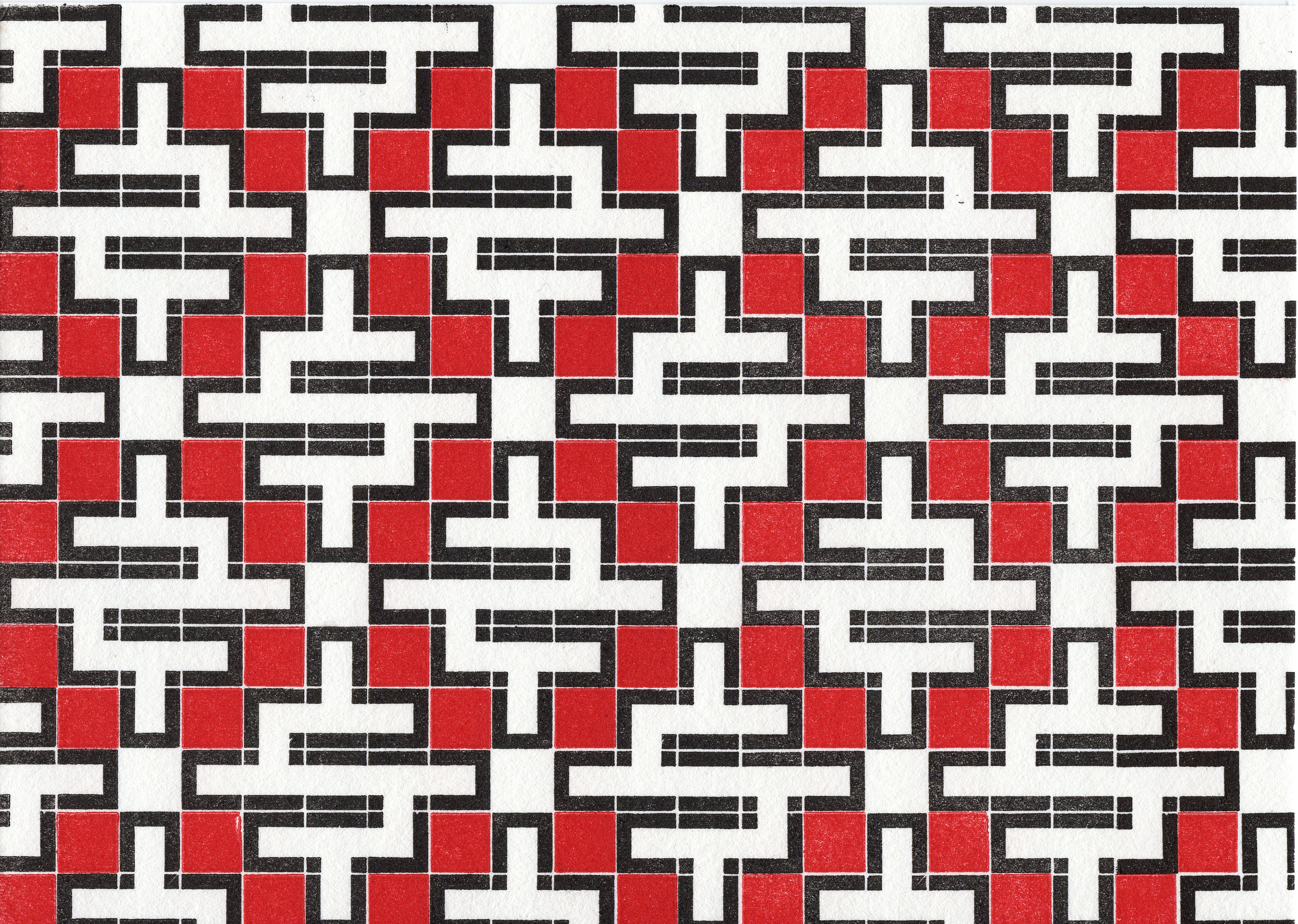
Pavel Zoubok Gallery is exhibiting the hand and laser cut mylar 3-D drawings of Imi Hwangbo. Using layers of colored mylar sheets, Hwangbo creates intricate geometric reliefs that have both depth and line. In the piece “Azure Seer” (2004), a grid of squares is meticulously cut from each sheet of mylar.  Sheets with larger squares are at the front. With each sheet the squares get ever so slightly smaller until the farthest sheet has no cutout. This method creates a grid of inverted pyramids. It is very common for Math enthusiasts to cut and fold paper to make 3-D geometric solids. Hwangbo’s process of cutting into the layers to make geometric voids is a fresh approach.

11-1

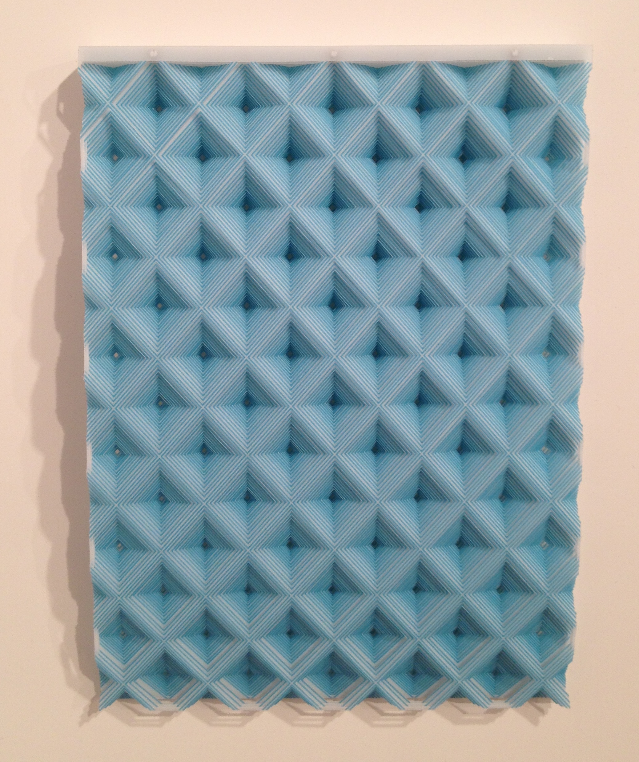
Imi Hwangbo – Azure Seer (2004)
Courtesy of the artist and Pavel Zoubok Gallery

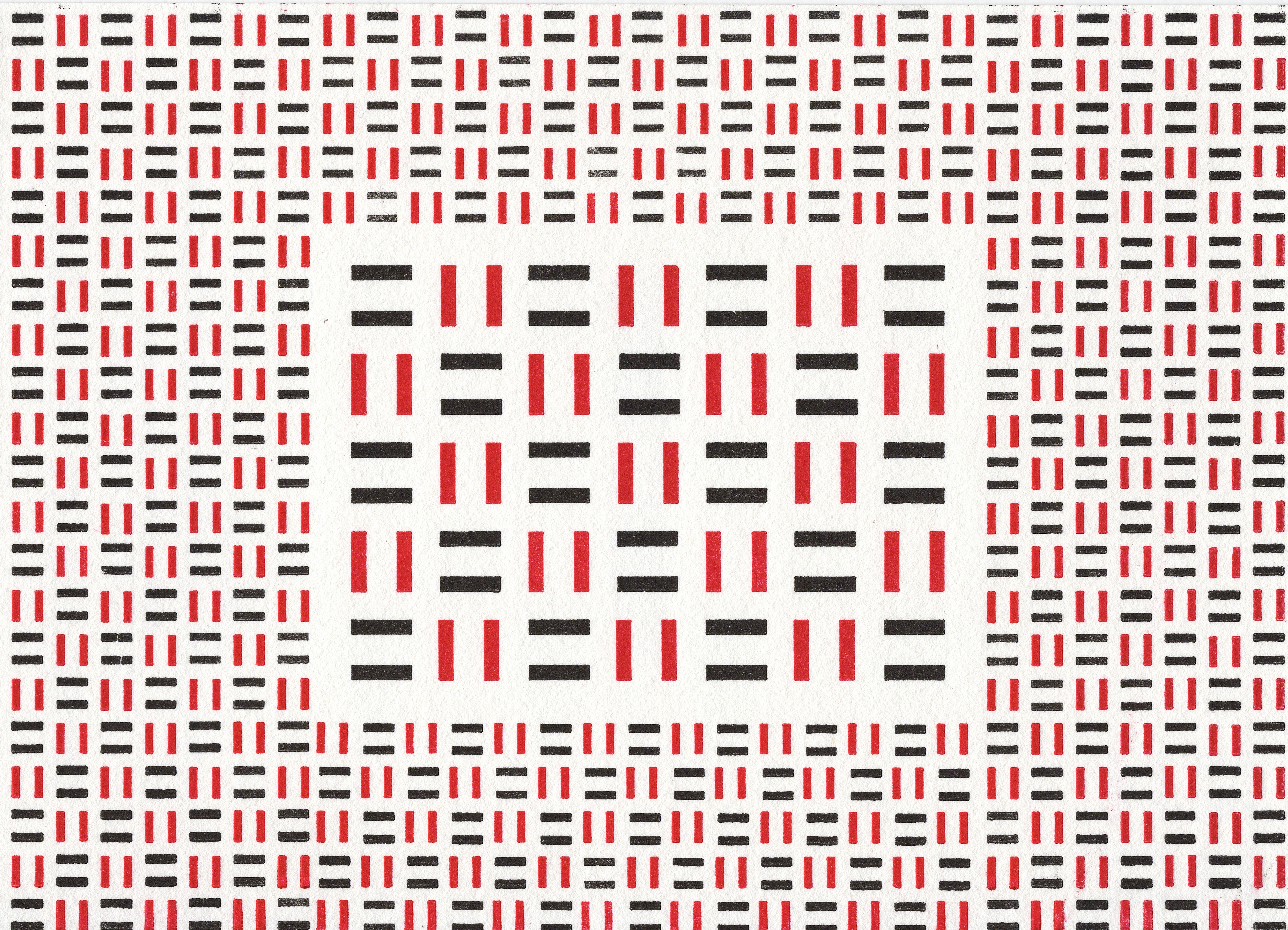
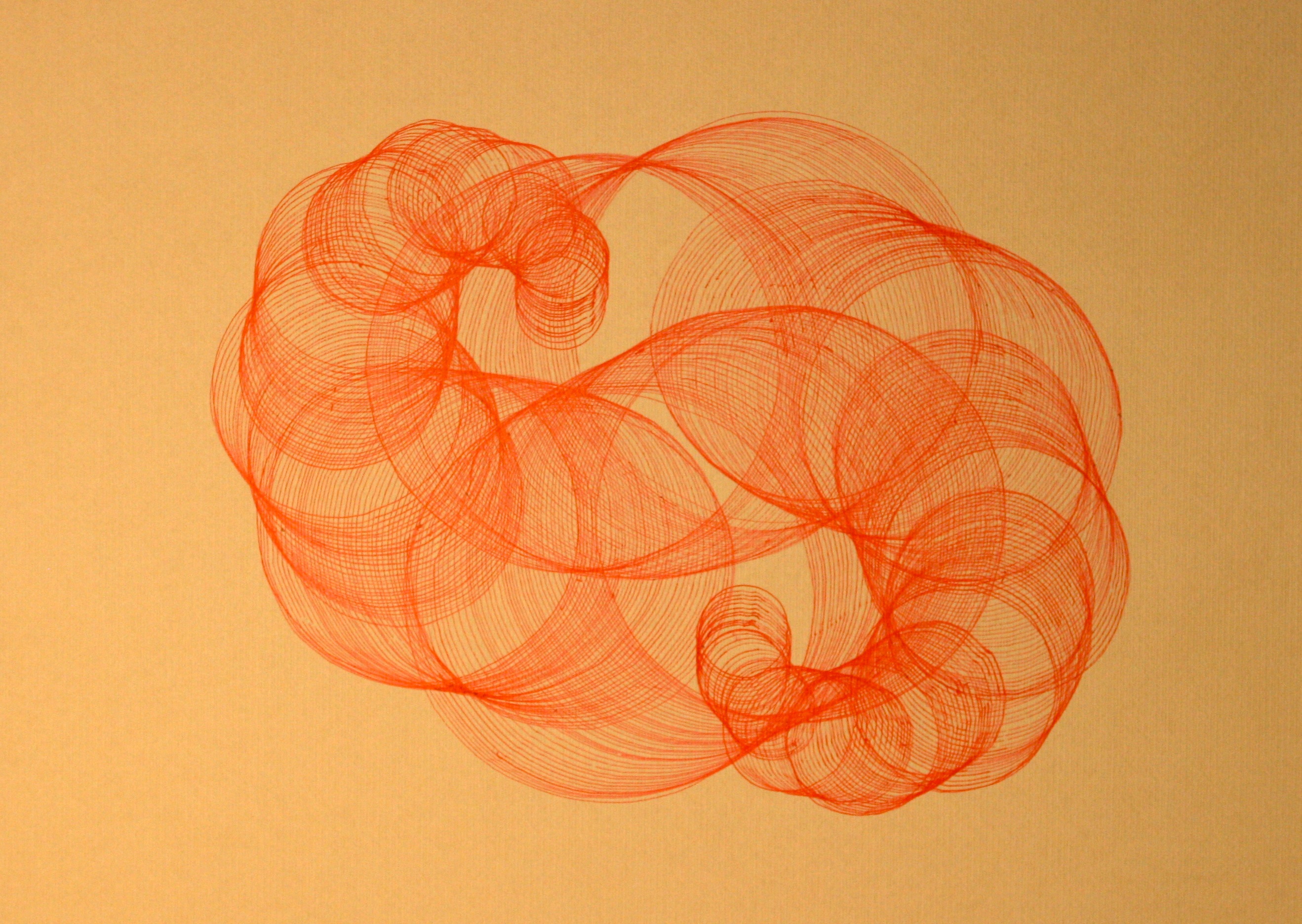
In a more recent work named  “Lens 2” (2013) Hwangbo has layered a series of net-like webs of patterns in hand-colored red and blue sheets. In the pattern there are intersecting blue circles with perpendicular diameters. These diameters run diagonally across the work creating a diamond grid. Then, in red layers there are two different sizes of smaller circles. Looking at a small section you can see the order 4 rotational symmetry around the center of each blue circle.

11-2 2

Imi Hwangbo – Lens 2 (2013) – DETAIL
Courtesy of the artist and Pavel Zoubok Gallery

Hwangbo has been influenced by ornamentation from religious and spiritual architecture. This inspiration enables her work to transcend the flatness of the mylar and create environments of space, light, and pattern.

Richard Kalina at Lennon Weinberg Inc.

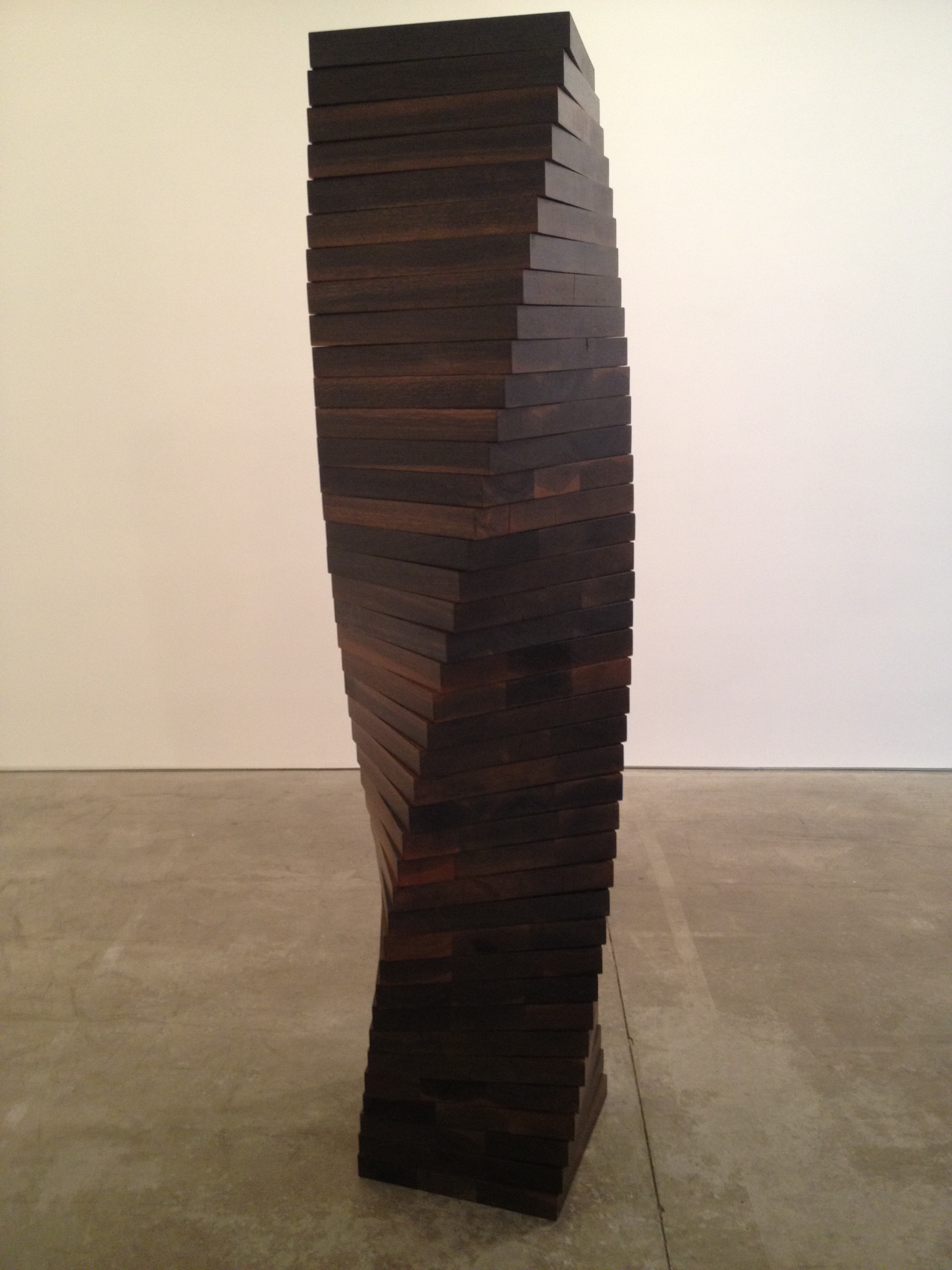
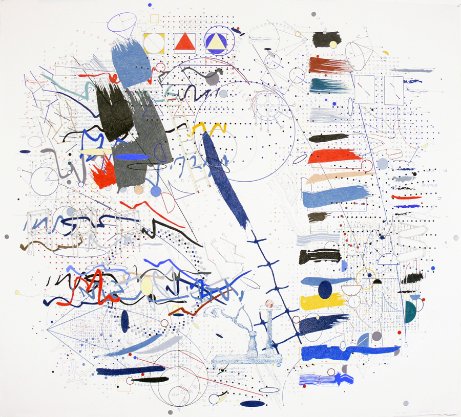
My fascination with MathArt goes beyond art whose direct theme is Mathematics. I am also intrigued by work that is inspired by, or is a reaction to, the systems in Mathematics. Richard Kalina‘s new work falls in this category. Lennon Weinberg Inc  is currently exhibiting his works on paper, as well as collages on linen. Using a  background grid consisting of overlapping rectangles of white paper in  “Nominal Space” (2012) Kalina paints a collection of brightly colored circles. These circles interact through a network of black straight lines that connect them. The lines have one of three possible directions: vertical, horizontal or diagonal, from lower left corner up to upper right corner. Each circle can have one, two, or three connecting lines radiating out from it, creating angles of 45 degrees. 90 degrees, 135 degrees, or 180 degrees. The patterns of connections seem like an homage to the molecular and  geometric models we made in high school.

e_9310_Nominal_Space

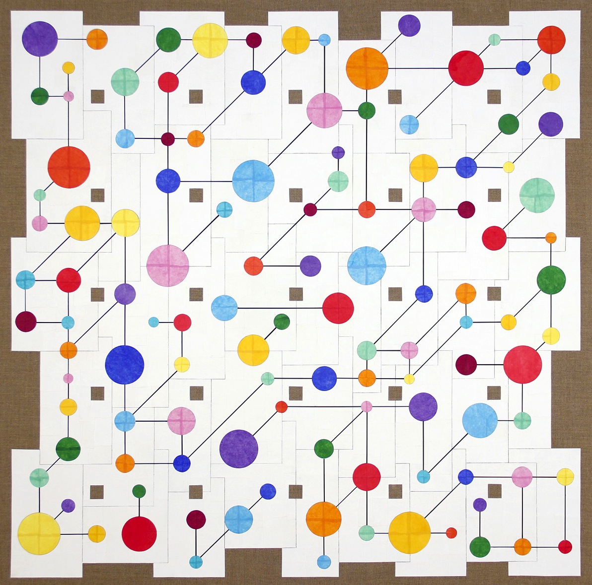
Richard Kalina – Nominal Space (2012)
Courtesy of the artist and Lennon Weinberg Inc.

For the collage on linen “Neochrome” (2013) Kalina changed the rules with regard to the angles of the connecting lines. There are many more possible angle structures and the circles can have up to six connections. “Neochrome” has the energy of a complex flow chart with many possible routes to connect different elements within the network. Richard Kalina has had a long and esteemed career in the Arts. His work is included in many museum collections including the National Museum of American Art, the Fogg Museum, and the Wadsworth Atheneum. Kalina has also served as a contributing editor for Art in America magazine.

e_9307_Neochrome

Richard Kalina – Neochrome (2013)
Courtesy of the artist and Lennon Weinberg Inc.

Dikko Faust – Tesselations

Dikko Faust is the printer and co-owner of Purgatory Pie Press, a letter press publishing company in Tribeca, Manhattan that he runs together with Esther K. Smith. Faust also teaches a course on Non-Western Art History at the City University of NY. It was his experience in looking at Non-Western patterning that has lead to his recent series of prints called Tesselations. The prints are made by hand setting bits of lead to create the pattern, using only red and black ink. Each patterned print has its own set of distinct symmetries. Today, I will discuss two prints from the series.

The first one is “Tesselation 4 -Nessonis 1: Pyrassos”. Printed on the back of the card is the following descriptive text: “A serving suggestion for a Middle Neolithic stamp seal design found in three sites in Northern Greece”:

Dikko Faust - Nessonis 1: Pyrassos - Hand set block print - 2012

Dikko Faust – Nessonis 1: Pyrassos – Hand set block print – 2012

I see this print as a fragment of a wallpaper symmetry, because the repetition in the pattern is based on the symmetries between the shapes. The white figures with the black outlines that resemble a $ or an S and the 8 red squares around them have order 2 rotational symmetry. If you rotate the figure 180 degrees, you have the same figure again. Each of the $ or s shapes has glide reflection symmetry with the upside down $ or S in the rows above and beneath it. In a glide reflection symmetry we see the mirror image of the original shape, but then it is glided or moved along the plane (in this case, along the paper).

The second print is “Tesselation 6- Magnified Basketweave”.  The text on the back of the print states “aka Monk’s Cloth or Roman Square Quilt As seen on NYC sewer covers”:

Dikko Faust - Magnified Basketweave - Hand set block print - 2013

Dikko Faust – Magnified Basketweave – Hand set block print – 2013

This print is a great example of reflection symmetry. It has two lines of symmetry: one horizontal though the center, and one vertical through the center. Another interesting mathematical feature of this print is the similarity between the larger sets of black or red bars and the smaller sets. Two figures are similar if they have the same shape and are only different in size. Both the large set of bars and the small set of bars form two sides of a square:  all squares are similar. The inner rectangle of larger bars measure 5 sets by 7 sets. It requires a rectangle of 11 sets by 15 sets of the smaller squares of bars to frame the large rectangle. There is a border with the width of one small square, so after subtracting 1 set from each dimension, we have the inner rectangle of 5 by 7 surrounded by a 10 by 14 rectangle of smaller sets of bars. The ratio of the dimensions of the larger to the smaller is 2:1.

Faust has made a whole series of these striking Tesselation prints. He has been inspired by what he has encountered teaching  art history, and what he sees all around him looking at art, and in the case of Tesselation 6, the streets of New York City. The mathematics in these prints go beyond the patterns themselves and connect the viewer with distant times and cultures, and links us all in a visual aesthetic.

– Susan Happersett

Chaos – The Movie

It is my personal mission as an artist to illuminate the intrinsic beauty of mathematics in a purely aesthetic realm. Translating mathematical subject matter to the picture plane of my drawings, I strive to enable viewers to appreciate this aesthetic, regardless of their mathematical background. I express the grace and beauty I find in mathematics through symmetries, patterns and proportions in my art. Many of my drawings are related to growth patterns such as the Fibonacci sequence and binary growth. I begin my work process by creating a plan or an algorithm. I make all of the decisions for the work beforehand and make a detailed plan in a large spiral drawing tablet that I refer to as my plan book. After I write out all of the specifications, I generate the actual drawing by hand using the rules from the plan. Through my drawings I hope to express both the aesthetics of my mathematical subject matter, as well as the aesthetics of the process of algorithmic generation.

In the past few years I have become interested in generating drawings using fractal forms based on the repetition of similar shapes. I begin with a largest instance of a shape and incorporate copies scaled by powers of ½. I developed a drawing based on the four quadrants of the Cartesian coordinate system. Each drawing begins with 8 spokes. The line segments fall on the coordinate axes and the lines y=x and y=-x. Once I have drawn the initial shape, each spoke becomes the starting point for a new 8-spoke shape in which the line segments are ½ as long as the original spokes. Then those 64 spokes become the starting point for 8-spoke figures with line segments ¼ the length of the first line segments. Next, the 512 spokes each become the bases for an 8-spoke shape with line segments 1/8 the length of the original spokes. This process creates a circular fractal network of lines. While producing these drawings, I have developed a type of mantra to remember where I am in the drawing. I need to keep count and this becomes quite complicated and rhythmic, especially when I reach the third iteration.

Mathematics and art both enable humans to better understand the world around them by uncovering patterns and structures. Chaos Theory is one of the topics in mathematics that, I feel, particularly throws light on the intricacies of the human condition. Chaos Theory shows that even within apparent disorder there can often be found both order and structure. My investigation took me to the earliest ideas on Chaos Theory. In 1961 Edward Lorenz inadvertently discovered the phenomenon of sensitive dependence on initial conditions by noticing the effect of rounding off decimals had in a computer-generated sequence of calculations for weather prediction. This event marked the (re-) discovery of what is now commonly known as Chaos Theory. I decided to visually interpret this phenomenon in my drawings, by using my basic 8-spoke pattern and continuing with multiple iterations using stencils with a small margin of error. The errors accumulate to create these cloud-like, chaos- derived drawings. If the viewer spends a few moments gazing into what at first appears to be a chaotic cloud they will begin to see the pattern of the fractals develop. There is a hidden structure to these drawings, as well as a sense of growth through time. This process of layering iteration on top of iteration takes weeks of work and through the process the drawings go through interesting changes and developments. I wanted a way to incorporate this sense of time and change into my art. It was time to make a movie.

I started with a fresh large black sheet of paper. Then I installed a digital camera over my drawing table. I began my drawing process, but after each line I took a still shot of the drawing. I continued this process over months. I wanted the movie to have an organic handmade feeling to it so I made a number of changes throughout the process. The frequency with which I photographed the drawing fluctuated. Sometimes I would take a picture after each line, sometimes I would complete a small cycle of lines before taking a picture. This change produced skips and jumps in the rhythm. Occasionally, I moved the camera closer to or farther away from the drawing. I also included myself in the photos as the generating mechanism: there are a few shots where you can see my hands. At a point where the drawing was getting quite complicated, I adjusted the camera so you could see my feet coming and going from view: the drawing was becoming a dance. Leaning over to draw and then pulling away to take a picture created a very physical element to this work and I wanted to express that physicality. Thousands of still digital photographs were taken during the drawing process. These photographs were put into consecutive order and then repeated in reverse to create the sense of both growth and decay. The edited product is a 6 minute video titled “Chaos Night”.

I knew from the beginning of the process that I would add music into the final production. I contacted composer Max Schreier, and discussed the structure and mathematics I wanted incorporated into the music. I wanted to make sure the number 8 played a major role in the structure of the music to mirror the 8 spokes of the drawing. Max agreed to write and perform a 6 minute composition based on these specifications. Influenced by Arnold Schoenberg, he based the music on a series of 8 sequential notes. While the bottom voice of the organ plays a drawn out rhythm associated with the first iteration of the drawing, the violin accelerates with the increased speed of the smaller iterations. The right hand of the organ creates small disturbances, each catalyzed by the random insertions of hands, feet and rulers in the video.

– Susan Happersett

Originally presented at Bridges Art Exhibition – Banff, Canada – July 2009;

More Chelsea Galleries – February

Robert Morris at Sonnabend Gallery

Sonnabend Gallery is exhibiting large wooden sculptures by Robert Morris. Morris is one of the most important American artists and preeminent practitioner of Minimalism. The twelve sculptures in this show are from his “Hardwood Series” and they are all recent reinterpretations of plywood constructions from the 1960’s. Craftsman Josh Finn facilitated the actual production of the work. I was particularly drawn to three totem-like sculptures that were each stacked columns of square planks. In “Serrated Column” (2012) each consecutive plank is rotated 90 degrees. Each square has diagonals that are parallel to the sides of the squares above and below.

photo

Morris – Serrated Column – 2012 – Wood

“Twisted Column” (2012) is a stack of  40 squares that rotate a total of 90 degrees. Each square is only rotated 2.25 degrees. This subtle rotation gives the illusion that it is a smooth surface instead of separate square planks.

Morris - Twisted Column - 2012 - Wood

Morris – Twisted Column – 2012 – Wood

In “Spiral Column” (2013) the squares are rotated around a corner instead of the center. One full turn of the spiral is formed by planks. This work is an engineering marvel. Standing in front of this sculpture in the gallery it seems like magic that it does not tip over. Morriss’ column sculptures illustrate the many visual possibilities that can be explored using the repetition of a single geometric element.

Morris - Spiral Column - 2012 - Wood

Morris – Spiral Column – 2012 – Wood

Beth Campbell at the Project Room at Josee Bienvenue Gallery

In the Project Room at Josee Bienvenu Gallery, Beth Campbell is exhibiting her drawings and mobiles in an exhibition titled “My Potential Futures”. The works on paper are handwritten text-based diagrammatic drawings. The wire mobiles are a 3-D extension of the drawings. The structure of the mobiles create a binary fractal pattern. Each mobile is attached to the ceiling by a single wire that then divides into two wires, then each of those wires split again into two wires each. The 4 wires split into two wires each (now 8 wires). This continues through 7 iterations. Start at the top and then there is a choice of two possible routes, a yes or no question or ones and zeros if you are thinking in binary code.

Campbell - Mobile

Campbell – Mobile

Chelsea Galleries – February

Paul Glablicki at Kim Foster Gallery

On my recent visit to the Chelsea gallery district in Manhattan I noticed a number of exhibitions featuring art with Mathematical influences. At the Kim Foster Gallery there is a show of exquisite drawings by Paul Glabicki based on Einstein’s Theory of Relativity. These works have layers of scientific data, charts, and mathematical formulae. In drawing RELATIVITY #8 Glabicki has drawn a series of Pascal’s Triangles in the mix of images.

Glabicki- RELATIVITY #3email

Glabicki- RELATIVITY #8

A Pascal’s Triangle is a triangular array made up of numbers. The number of terms in each row corresponds to the sequence number of the row. For example, the first row has one number (1) , the second row has two numbers (1,1), the third row has three (1,2,1). In Pascal’s Triangle, the first and last term of each row is 1. The middle terms are calculated by adding the two numbers directly above. Here is an example of a small Pascal’s Triangle.

              1
          1      1
      1       2     1
    1     3      3    1
  1     4     6     4   1
 1    5   10    10   5    1

In RELATIVITY #3 Glabicki has drawn Geometric studies of internally tangent circles. These circles share only one point and the smaller is inside the larger.

Glabicki-RELATIVITY #8email

Glabicki – RELATIVITY #3

What I think is fascinating about these drawings is the way the mathematical and scientific elements are used as small pieces of the total work. They are transposed from abstract ideas into aesthetic elements of a much larger complex picture:  the artist’s expression of the Theory of Relativity exploring the physics of time and space, through the arduous process of  intense layering of images. Paul Glabicki is well known for his experimental animated films that use hand drawings.They have appeared at many film festivals and exhibits, including at the Whitney Biennial and the Venice Biennale.

Austin Thomas at the Hansel and Gretel Picture Garden

At the Hansel and Gretel Picture Garden there is a show of work by Austin Thomas. Exhibited are twelve drawings on paper, all of which have interesting proportions and geometric elements. The work that seems to really express mathematical principles is a sculpture the artist refers to as a “steel drawing”, made of two black and two white rectangular prisms. These are 3-D line drawings and by stacking them in this perpendicular fashion Thomas presents a nice study on squares and rectangles. Viewing the work from different angles and positions throughout the gallery offers many possible relationships between shapes, as well as the positive and negative spaces created by the open structures. Although it does not move, this is not a static sculpture. The prisms can be stacked in other ways offering Thomas a multitude of permutations to explore.

photo

Thomas – Steel Drawing

Richard Sarson: Math Artist

On my quest to find more MathArt I am always looking for clues. The cover of the January 2014 issue of Wallpaper magazine features a beautiful black line drawing . At first I thought the photograph showed a sculpture, but upon closer inspection I discovered that it was, in  fact, hand drawn with a compass by Richard Sarson. An award winning British artist and designer, Sarson has had his work featured in many publications, including the New York Times, Seed Magazine, Creative Review, and Eye. Sarson has exhibited extensively in Britain, including a recent show at Somerset House.
sarson1
Sarson’s meticulous use of the compass creates the optical illusion of what – at first glance – resembles a tangle of three dimensional wire tori. Sarson created a video in 2010  titled “Circle” that shows his process creating a single torus drawing. A torus is the mathematical term for a doughnut-like surface. In topology, a Torus has genus 1 because there is only one hole.
In 2008, Sarson did a series of drawings he calls “Graph”. For these works he drew directly on millimeter grid graph paper. This technique allows the viewer a clear look at the Mathematical backbone of these drawings.
sarson3
This drawing uses circles in descending order of the lengths of the diameters, starting with 80 mm, down to 70 mm, 60 mm, 50 mm, and finally 40 mm. This is an interesting twist on shifting concentric circles. The largest outer circles have a diameter  twice the size of the smallest inner circles.
sarson4
Not all of his drawings are based on circles. In this next drawing Sarson used a straight lines  to create a sort of hypnotic drawing, working within the grid. Using 17 evenly spaced points 5mm apart horizontally along the top of the drawing and 17 evenly spaced points 10 mm apart 80 mm below the first line of points. The center points in each of the 2 rows of points line up along the vertical grid line. With this point structure in place, each point on the top row connects with every point in the bottom row. This creates an interesting study in the density of lines and shifts in the diamond patterns from the top 40 mm of the figure and the bottom 80 mm.
Richard Sarson uses Mathematics to build the framework for his drawings and then, painstakingly, brings his drawings to life. I must commend him for only using the most basic tools and executing all of his drawings completely by hand.
-FibonacciSusan

Fibonacci Circle Curves

“How does an artist take inspiration from a Mathematical concept and transform it into a work of art?”

This is a question people have asked me many times. Each artist follows her own path, but translating the aesthetic elements of a mathematical topic into the visual realm of Art is my personal journey. I will discuss the process I developed to to create my most recent series of drawings, which I refer to as “Fibonacci Circle Curves”. I will map the artistic process from my selecting a Mathematical theme, through the many steps it takes to complete a drawing. This is a process that took 18 months to develop.

Through the years I have made many drawings exploring the Fibonacci Sequence. The recursive nature of the sequence makes it an interesting subject for abstract drawing. My new series of drawings investigates the visual qualities of intersecting circles whose area measurements are in proportions related to the Fibonacci Sequence. This experiment is a different way to look at the ratios of consecutive Fibonacci numbers.

EPSON MFP image

The measurement of the area of the first circle in the sequence determines the area of each subsequent circle.The measurement of the area of the second circle is the same as that of the first circle. The measurement of the area of the third circle is twice the first. The measurement of the area of the fourth circle is three times the first. The measurement of the area of the fifth circle is five times the first, etc. This series of circles illustrates the Fibonacci Sequence: 1,1,2,3,5,8…, though  the measurements of their areas.

EPSON MFP image

I made templates for the first eight circles in the series and started to experiment. I started off by drawing the circles in a straight line. I drew the first circle and marked  its center point. then I began the second circle at that center point. Then each subsequent circle started at the center point of its predecessor. In this format it is possible to draw a straight line connecting the center points of each of the circles. I immediately noticed there were some aesthetically interesting shapes created by the intersecting circles, but I was not satisfied. I decided to continue to manipulate the circles. I broke up the straight line connecting the center points into angled line segments. Instead of having the center points of the circles line up, the line segments connecting the center points should create angles less than 180 degrees. After some time it became clear that the best angle to use was the Golden Angle. The golden angle has a measurement of approximately 137.51 degrees. It is the smaller of the two angles formed by two radii that divide the circumference of a circle into two arcs so that the ratio of the measurement of the large arc to the small arc is equal to the ratio of the  measurement  of the total circumference to the measurement of the larger arc.

EPSON MFP image

After curving the series of circles, the space created between the arcs started to look much more interesting. I was still not satisfied with the image, however. I began a process of using this curve as my basic building block. I made a number of curves on transparent paper and I began to superimpose and shift the images. I did not want the drawing to look static but wanted the image to have a sense of movement. I came up with a method of drawing using the line segments created by connecting the center points of adjacent circles. Using these line segments as a guide, I dragged the template of the first circle, so that the center point stayed on the guideline. Then I drew multiple circles until the first circle was completely inside the second circle, sharing one circumference point. I repeated this with each of the circle templates. The finished product was finally an image with potential.

EPSON MFP image

This elegant structural unit is the starting point for all of this new work. I have made numerous drawings using multiple Fibonacci circle curves. either shifted or rotated or, and superimposed on top of each other, creating some surprising interactions. I continue to explore the shapes produced through this process. I have made work emphasizing the negative spaces, painstakingly filling in between the lines. By cutting up the drawings and rearranging the sections I have made collages and Artist’s books allowing the viewer to focus on small sections of the curve.

Fibonacci Circle Curve Red

Fibonacci Circle Curve Red

I hope this detailed explanation of my artistic practice offers an interesting behind-the-scenes tour of my process, beginning with my thinking about Fibonacci ratios and circles, and progressing through experiments leading to new drawings.

– FibonacciSusan